


SUMMARY
Verlas is an e-commerce startup specializing in diamond jewelry. I was tasked with redesigning the website to improve conversion and SEO.
Team
1 UX Designer (me), 1 Content Designer, 1Product Manager, 2 Developers
Contribution
UX . Visual . Research
Time Period
November 2023 - March 2024 (3 months)
The Challenge
BUSINESS GOALS
Improve Verlas' visibility in search engines and position it as a trusted diamond jewelry shopping site.
Drive more purchase decisions on the Verlas' website and increase AOV with upsells/cross-sells.
PROBLEMS
Verlas relies solely on its website to generate revenue. However, low traffic and poor conversion indicate gaps in discoverability, user engagement, and overall shopping experience.
Understand the problem
DISCOVERY
User interview
Conduct interviews with online diamond shoppers to understand their pain points when shopping at Verlas and identify barriers to selecting Verlas as their shopping platform.
Google Analytics
Google Analytics indicates that the website's traffic and conversion rates are below industry standards, contributing to Verlas' low revenue.
Competitive Analysis
Analyze competitor site features, information architecture, and checkout processes to identify areas for Verlas' optimization and unmet customer needs.
Area of focus
RESEARCH INSIGHTS
Reduce purchase uncertainty
The results of the competitive analysis indicate that Verlas has insufficient information on the specifics of jewelry and diamond education.
Improve brand reliability
According to the user interview, Verlas can’t be recognized as a reliable diamond jewelry retailer.
Search Engine Optimization
Google Analytics indicates that Verlas has low organic traffic and poor conversion rates.
Affinity diagram from user interview

Design Exploration
PREPARE
Analyze website IA to finalize design scope
Based on research insights and Verlas' website information architecture, we decided to redesign the product description page (PDP) and About Us page. Before investing in a polished UI, I presented wireframes to stakeholders to align on the design concept early in the project. It helps their feedback focus on layout, hierarchy, and user flow.

Produt Description Page

About Us Page

HIGH-FIDELITY PROTOTYPE
A redesigned product page with a comprehensive description and diamond education
-
Include measurements, materials, and diamond specifications in the product detail.
-
Provide diamond education and brand reassurance to prevent users from leaving the current page to do additional research about the product.

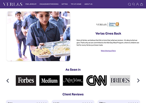
A restructured "About Us" page to showcase Verlas' history, value, and commitment
-
Introduce the founder and brand story to make Verlas feel human, transparent, and accountable rather than an anonymous jewelry site.
-
Explain diamond sourcing and craftsmanship to strengthen credibility.
-
Add third-party validation cues instead of vague claims to improve reliability and purchase confidence.

A brand new blog page to improve Verlas' visibility in search engines
-
Organizing content into clear keyword clusters (e.g., Diamond 101, Lifestyle & Trends, Gift Guide) makes it easier to publish consistently around search-intent themes.
-
With a scannable, consistent article grid that increases internal links to individual posts and helps search engines discover more pages faster.
-
Adding the “Discover Verlas Collection” section creates direct pathways from blog content to product browsing.


Test & Iteration
Iteration 1
Better visual hierarchy and more upsell opportunities
-
Improve scannability and decision speed by restructuring product information into a cleaner hierarchy.
-
Adding a “You May Also Like” section supports comparison shopping behavior and can increase AOV or reduce bounce rate when the first item isn’t perfect.


Improve scannability and add more trust signals
-
Improve scannability and reduce cognitive load by restructuring the page into clear, titled modules with strong visuals, which keep users scrolling rather than bouncing after a long intro.
-
Build credibility faster through “proof-first” trust signals by showcasing certifications/badges and linking to sourcing/craftsmanship details.
-
Enhance brand reliability by providing client reviews.
Iteration 2


Reduce friction from lower commitment
Add “read time” and category chips to help users choose articles faster, reducing friction from lower commitment.
Iteration 3
Before

After

Shipping the new webpages
By the end of the project, we had shipped 8 new webpages, ranging from the Verlas.com about us page to several key product pages to the reimagined blog page. The following KPI confirmed that my design solutions were effective and impactful.
IMPACT
15%
Increase in website Traffic
8%
Increase in conversion Rate
22%
Increase in monthly revenue
Reflection
Designing for trust is a system, not a single section
For luxury jewelry, trust isn’t one badge or one paragraph. It’s built through a chain: clarity → proof → reassurance → social validation. The work on the About page and PDP helped me see trust as a distributed UX problem: sourcing transparency, certification cues, and scannable diamond education all work together to reduce risk and increase confidence.
How this project shaped me as a designer
Verlas pushed me to think beyond screens and focus on how each page contributes to a bigger funnel. I became more intentional about explaining design rationale in business terms—reducing customer uncertainty, increasing product discovery, and improving the clarity of decision-making.